
A Light Drama
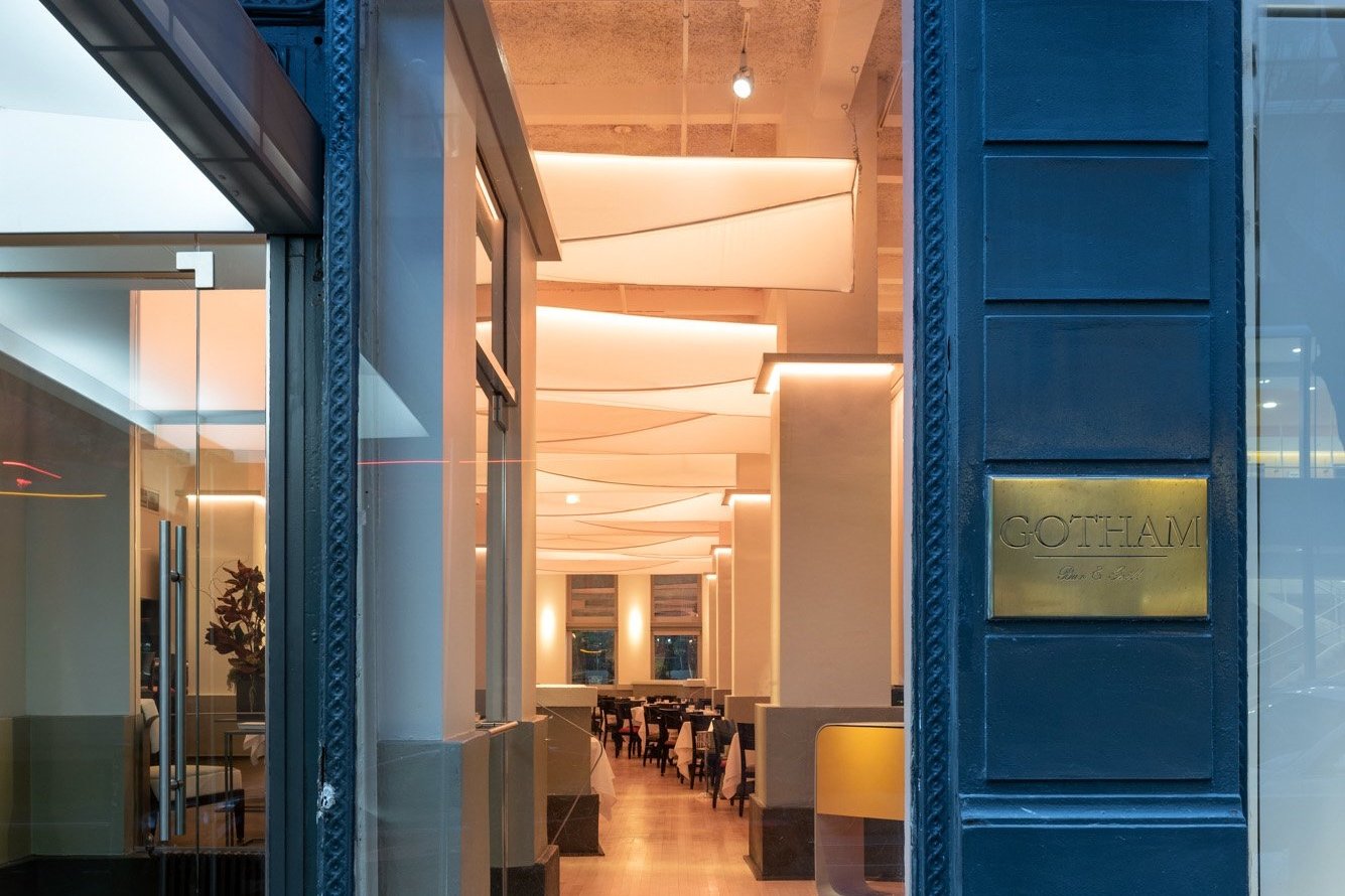
Gotham’s new lights are nine 20-foot by 30-inch individual fabric light sculptures
by David Weeks Studio and Andrea Lauer.
It took a special cast of characters to remake Gotham’s lights. Of many challenges in our para-pandemic renovation, they were a predictable sticking point in our aim for “the sweet spot”—just the right amount of change that would revive Gotham but keep its spirit intact. After all else was settled and time was running out, the lights still loomed large.
For what could possibly top Mary Bright’s telltale, if eventually tired, “parachutes,” “jelly fish,” “clouds” (there were some less flattering nicknames). We ran through many close-but-no-cigar concepts, too many for the patience of designers and check-writers alike. But we knew the lights would be the capstone of our renovation, overtly competing with the most recognizable feature of our room. They would determine whether or not we had nailed it.

The second generation of Mary Bright’s lights watched over Gotham diners for more than thirty years.
Fortunately James Biber, Gotham’s original architect from 1984 who had agreed to oversee our redesign, thought of David Weeks at the eleventh hour. A Brooklyn-based designer renowned for his sculptural lighting, David mobilized a dream team that consisted of eight skilled engineers and artisans from his studio with the addition of fashion and costume designer Andrea Lauer. Together they achieved the improbable in just six weeks—the nick of time for our delayed but suddenly rushed November opening after the all-important liquor license came through.
Now when you walk in Gotham’s made-over room, it seems to soar. (Optimistic metaphors abound!) With David and Andrea’s lights we were able to take off into our next chapter, and to take a breath. Here in the words of their creators are some of the facts and fantasies that went into their making. We thank them all and want to especially acknowledge David’s Managing Director Lydia Hummel, whose belief in our collaboration inspired all players to rise to the occasion.
A Conversation between Bret Csencsitz, James Biber,
David Weeks, Andrea Lauer, and Jeff Croiter
Bret: So Jim, why did you agree to “come back to Gotham.” It’s been one of our most poignant reopening stories that the same architect from 1984 came back in 2021. It certainly gave me a great sense of security to be in your hands.
James: When I got your call about reopening Gotham with some cosmetic changes, I had already written about its closing. Then when we met to discuss your ideas, I was flattered that you even wanted my input. When you asked if I would take on the project as the (re)designer, I hesitated because of your budget and my availability, but then—upon reflection—I decided that it was an important chance for me to update some things that I would have liked to tackle decades ago. It also hit me that if anyone was going to mess up Gotham, it should be me.
Bret: It all went smoothly, but then there was the reinvention of the fabric chandeliers. I felt it was important that we maintain the use of fabric in the redesign, which was proving challenging. After months of trial and error, you suggested David Weeks, who I was skeptical would want to take us on, given his established body of work. I remember asking, Why would David do it?
James: David is a thoughtful artist, and he is the rare designer who can learn from history without mimicking it. That was perfect for Gotham; what we really wanted was the glowing quality of the light and fixtures, but using new technology and letting the high ceiling be more a part of the space. But this was an entirely different kind of project for him, and knowing David as a friend, I thought that, although it was somewhat out of his wheelhouse, he would find the project intriguing.

The Lapa Pendant, an example of David Weeks’ iconic sculptural lighting.
David: The challenge appealed to me as did the opportunity to work with Jim. My studio's design language is very form driven, and this was a serious departure from our signature precision metalwork. The use of fabric gave us the opportunity to go big in a whole new way, to say something new while adhering to our usual formal vocabulary. My final design relied entirely on form to be something exceptional; its simplicity is modernizing but still very New York. It’s also rare that I get to design for a specific space; after the pandemic, this project breathed new life into my team and studio.
Bret: Jim, do you recall what was involved in the original design, and what David’s team was contending with to take up this mantle?
James: Mary Bright’s “parachute” lights were simply Gotham’s most recognizable design feature. But they were never as important as the light they cast; everyone looked their best at Gotham. Light diffused through fabric is inherently seductive, and as lighted objects the parachutes (originally conceived as “clouds”) gave the space a grand scale.
The originals were rather flaccid until, about 28 years ago, we asked Bright to update them to the ones that lasted until Gotham closed in 2020. They had reached the end of their useful life, so there was the opportunity to rethink them.
No one had seen the room without the parachutes until David asked to remove them last fall; the difference was startling…the room was much grander, much taller, and much more open without them. Ironically it felt more like the room we remembered.
The new lights that David Weeks Studio designed and fabricated (in record time) learned from the old and incorporated the new. They are illuminated using technology that didn’t exist in 1984. They are taut and tailored, while the older ones were draped and gathered. The new lights are horizontal, visually raising the ceiling, while the originals were vertical, lowering the ceiling. The original fixtures were full, flowing, and pleated, like men’s suits at the time (think Miami Vice). The new lights are trim, contoured and fitted, more like today’s fashion.
Bret: I am curious, David, as a “sculptor of lighting fixtures,” how did you adapt to working with fabric, because when Jim first suggested your studio and I looked at your work, it seemed completely opposite.

David Weeks, James Biber, and Andrea Lauer racing the clock. Photo by Alan Tansey.
David: That is where designer and fabric expert Andrea Lauer came in. I needed someone who could understand and execute the lightness yet massive scale that I felt the space demanded. Our studio’s Managing Director Lydia met Andrea through a classmate from MIT, Jessica Banks of Rock Paper Robot. Lydia is always looking to complement our projects with the perfect partners, and Andrea brought a world-class technical expertise to “tame,” if you will, our fabric into the necessary forms.
Andrea: I was immediately intrigued by this project and the opportunity to bring a theatrical language into an iconic architectural space. I love that that James used a fashion analogy when comparing Gotham’s old and new lights. I work in fashion as well as theatre, and I have always thought of lights as “clothes for the ceiling.” They call for the same precision and love of material, creating a world above us as we dine. For Gotham’s lights, the challenge was to make nine 20-foot by 30-inch pieces and make them feel weightless, how to do that architecturally with the steel frame. Nautical sails were the inspiration for the shape, but we needed to think beyond boating materials to capture the necessary elegance. It became an exercise in minimalism.
And then there was the responsibility that the material we use be durable enough to last for 30 years, that it be easy to clean and flame resistant. Sasha from Rose Brand® really saved us, especially given our timeline. With most theatre closed throughout the pandemic, they were thrilled to be back to work and, like all of us, really pushed themselves to set us up. Listening to David, Jim, and lighting designer Jeff Croiter negotiate the nuances of concealing the lights inside the fabric, about the temperature of light and their lumens (brightness), helped direct the final choice of material. We landed on a cyc or backdrop soft-screen material. It’s durable but luminous, beautiful enough even for opera guests.
“There is no hard light source, so the pieces become these glowing objects that float above the space and engage in dialogue with the natural light that comes from the large windows.”
—Designer David Weeks
Bret: Speaking of Jeff, whom I have known for many years and was suggested by a longtime Gotham client, he and I started talking very early on about the lighting and how important it was for the room. Jeff, who is a busy Tony Award-winning lighting designer, did not need another project but agreed to work with us. This was of course amazing and another nice historical parallel since the original design was by Jules Fisher, a Broadway lighting legend. Together Jeff and David collaborated to finalize the overall glowing nature of the sweeping fixtures that I think memorialize the original but are also completely new.
Jeff: Hmm, yeah, it was something of a unique challenge for me, too, given the history. The “sails” have a weightless quality to them that allows gravity to serve as their primary driver of form. The quality of the light is soft and diffused, ethereal almost and very flattering. But without the “hard source” there was a lack of precision. I had to play with the other lights and find how the more articulated lighting would interact and complement these glowing sails. It was trial and error to some degree, and ultimately we ended up removing a lot of the theatrical lights and using fewer spots as articulated highlights in the room. David’s pieces hang like giant glowing louvres with the effect of creating a floating ceiling, which is really cool.
And the sails did not have a lighting source as part of the design. In determining how they would light and what would light them, we decided flexibility was imperative. All of the new lighting elements (sail, columns, and foyer) are color tunable and dimmable so the proper mood can be created.
Bret: I really can’t believe how it all came together. Thank you all. I look at the lights now, and they have this hypnotic effect that is soothing, and the curve of that interior beam makes me think they smile at us in a soft and encouraging way, while we work and dine and continue to find our way out of these challenging last two years and into an even brighter future, for Gotham, for New York, for our planet. They certainly got Gotham glowing again, maybe, if we’re lucky, for another forty years.
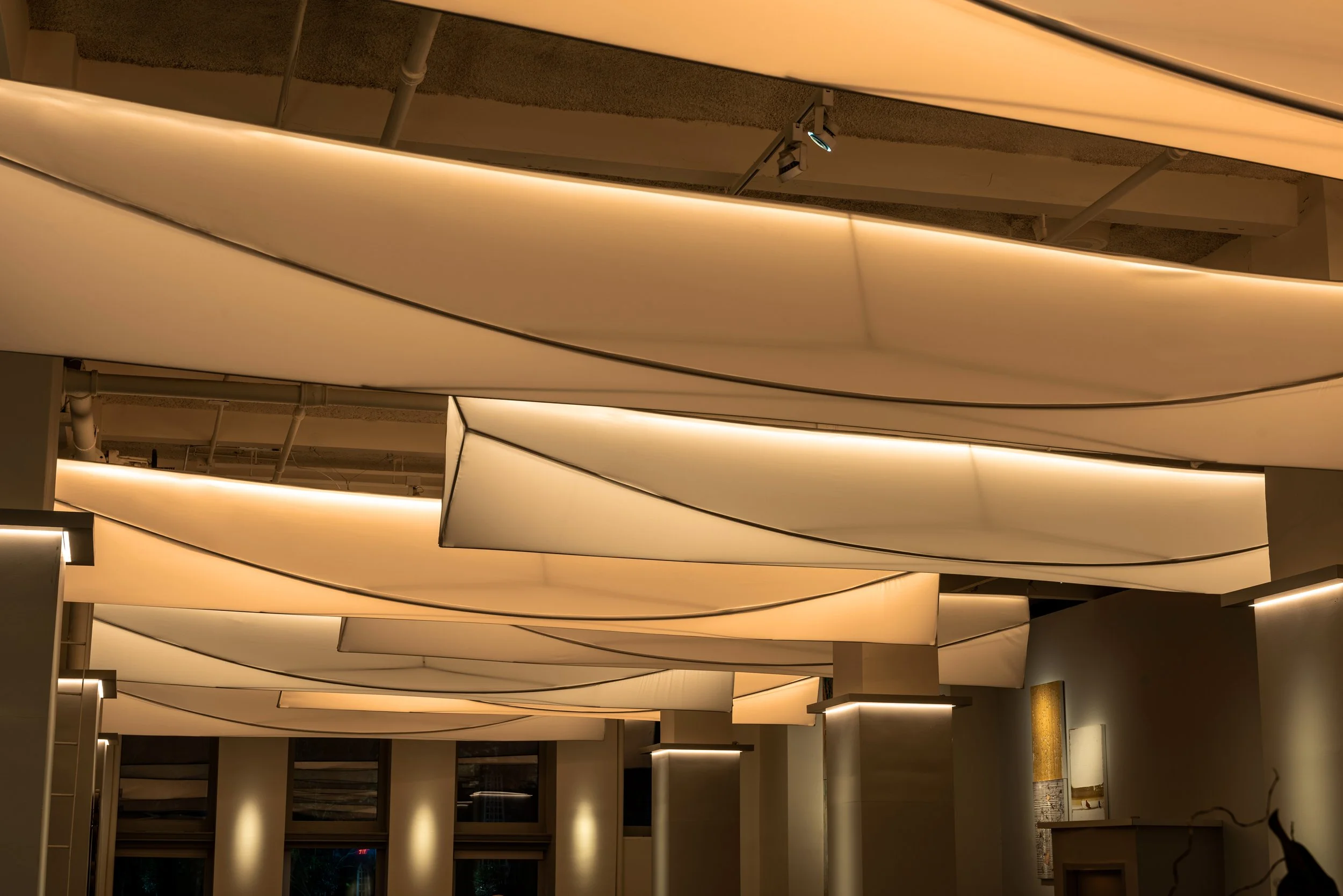
Photo by Alan Tansey.

Our Light Savers
The David Weeks Studio team left to right: Jay Hsaio, Senior Designer; Ryan Gallagher Studio Manager; Alex Beach, Manufacturing Engineer; Lydia Hummel, Managing Director; Melissa Wagner/Wagner Creative PR; David Weeks; Stephanie Stella, Director of Sales; Andrea Lauer, “Unicorn Genius.”